March 17, 2010

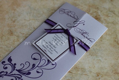
Royal Purple With Organza

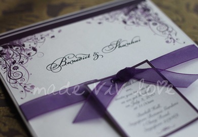
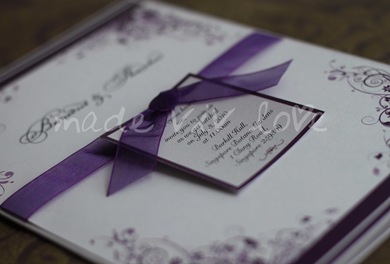
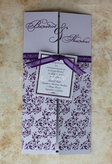
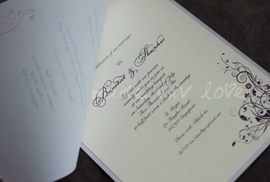
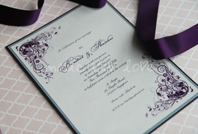
Instead of using satin ribbon in the previous concept of a more regal and elegant look, organza ribbon brings out a softer touch to the invitation card design. The semi translucent ribbon tame down the busy flourish vines by bringing the focus back to the couple’s solemnization event held at the Singapore Botanical Garden.

This mix and match of ribbons type will allows the couple to have a garden solemnization and a formal dinner reception all in one invitation card! :)

0274

0264

0253

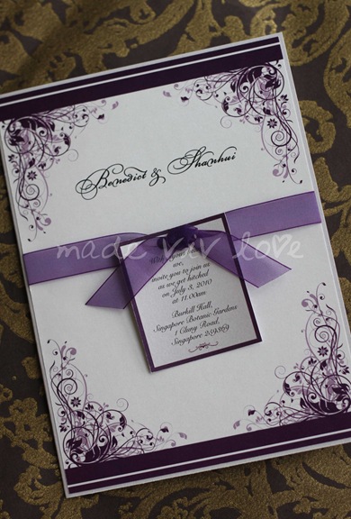
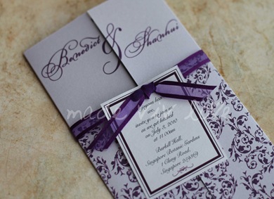
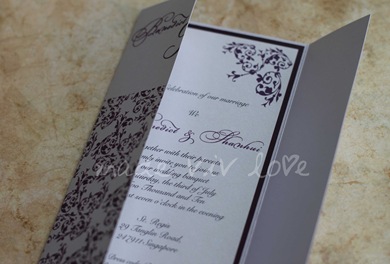
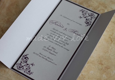
Royal Purple With Satin Ribbon

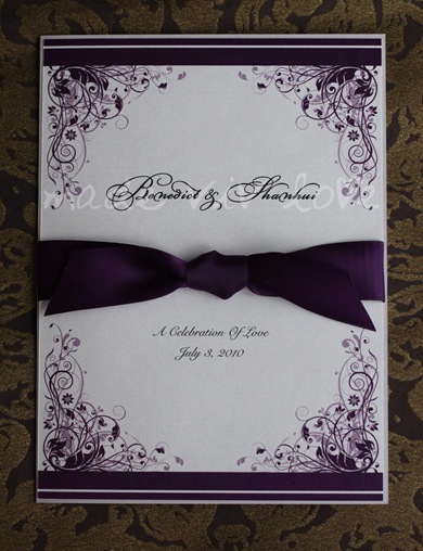
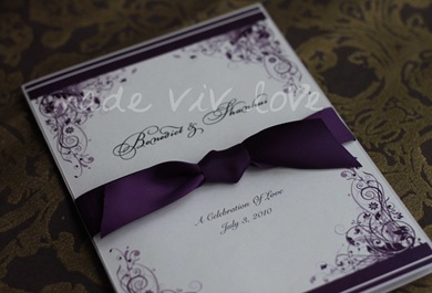
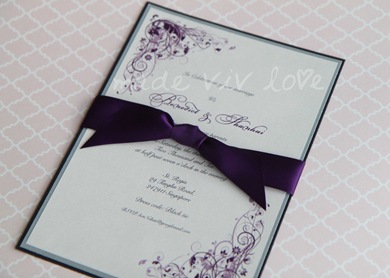
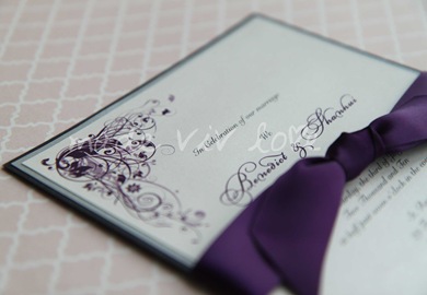
Shanhui and Benedict both love the colour purple, and would like to incorporate their favourite colour scheme into their wedding. After some exchange of emails, we have narrowed it down to cool shades of purple for their wedding.

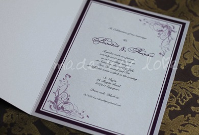
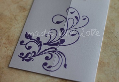
Using a deeper shade of purple gives this flourish vines a royal treatment and elegant touch to the design. I’ve also sourced a beautiful shade of satin ribbon that matches perfectly with the prints. The bold satin ribbon is an absolute match to their black tie dinner reception at St Regis.

0203 

0207

0217

Full On Vines

I’ve designed a similar style from my previous Juliet collection for Shanhui as she admired the more delicate vines motif from that range.

I’ve created a full background using the motifs and leaving the upper top part of the invitation card blank so that the couple names will be more prominent and stands out! :)

This is an extended design from the embossed finishing of the same card concept with window opening secured with ribbon knot.

The outer tag is solemnization invites for their morning event. For separates invitation for dinner reception only, the tag will be removed. Only the organza satin ribbon knot will be tied.

0282

0294 

The inside of the card will be the dinner reception invitation.

 0318

0307

Embossed Finishing

Hand embossed metallic finish purple vines motif on a shimmer lilac heavy card stock. The additional solemnization invitations for guest are printed on a separate card tied with an organza satin sided ribbon.

0345 (2)

0339

Double Layer On Transparency

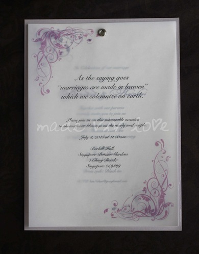
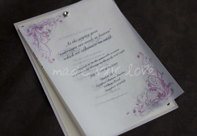
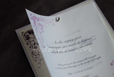
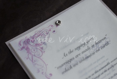
Working on a double layer concept, I’ve used transparency paper to print Shanhui and Benedict’s garden solemnization ceremony on the front layer.

The wedding dinner reception that follows is printed on a shimmer snow white paper mounted on a lilac heavy card stock. A crystal jewel paper fastener holds the transparency paper together with a bling!

0185

0198

0192

0195

0186

Special Preview For Shanhui & Benedict’s Wedding Invitation Cards

Shanhui and Benedict are both Singaporean couple that are based in London. I’m delighted to have an opportunity to work with Shanhui and be a small part of her wedding by designing their wedding invitation cards!

Since they won’t be making many trips back to Singapore, all the planning for wedding is correspond via internet. Instead of jamming her mailbox with attachments, I’ve decided to show the preview of designs I’ve created for their wedding invitation card.

They will be having garden ceremony solemnization in the morning, follow by a black tie reception at St Regis hotel. The main colour theme for their wedding is purple and it’s their favourite colour too! :)

After several exchange of emails, we have come to finalised the colours, motifs style and fonts for their invitation card. Here are some of the designs and variations for their wedding invitation cards.

Shanhui, I hope you like the designs! Do email me your feedback before I post the samples to you. Thanks! :)

0157

0166

0167

March 8, 2010

ConGRADUATIONS!

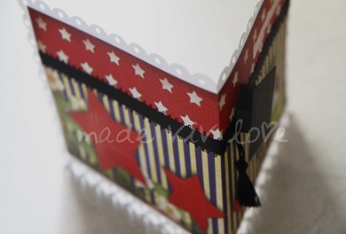
My sister adore many of my handmade cards, and she likes the thoughts process that was put into it in the making of a one of a kind card exclusively for her! That is why, on her graduation convocation last weekend … I’ve design something unique for her ;)

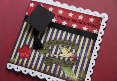
The theme for her graduation card is “THE STARS IS THE LIMIT!”
I have mixed and matched some of the papers I found, and created a vintage effect along the paper borders and had the stripy lines to match with my very American like stars!

I absolutely love the black ribbon, and decided that it was best match with this card! To make the card’s shape more interesting, I’ve punched holes along the sides the scallop paper. The result; CUTE! (^_^)
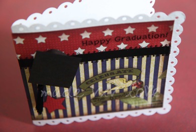
0608

0625

To top it up on this graduation card, how can one not have the mortar board that matches with your gown on your convo ceremony rite? So I’ve made a 3D mortar board for her with a tassel!

Hats off grads!!! Now the stars is your limit!!! All the best in her future and welcome to the working society! 
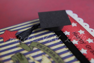
0615

0629

March 6, 2010

Pink Spring

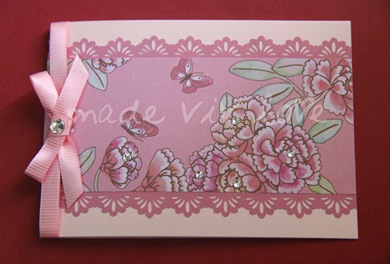
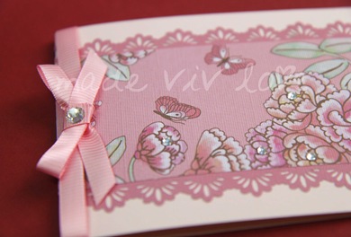
If you love pastel pink, this colour you’ll absolutely adore! :)

Lace trimming papers of matching colour to the flowers, tied with a lovely ribbon bow and adorned with sparkling Swarovski crystals.

0672

0666